How to Choose a Bathroom Vanity Color That Works With Existing Tile
The best bathroom vanity color usually responds to the undertone of your existing tile rather than matching it exactly. Start by deciding whether the tile reads warm, cool, or close to neutral, then compare painted and wood finishes against the tile, countertop, flooring, and hardware in the room’s actual light.
A vanity can coordinate without disappearing. In many bathrooms, a controlled contrast looks more intentional than a near-match that is slightly too yellow, pink, gray, or brown.
Start with the tile’s undertone
The main color of a tile is only part of the decision. Its undertone is the subtle cast that makes it feel warm, cool, or balanced.
Look for these clues:
- Warm tile: beige, cream, tan, soft gold, or yellow-brown notes.
- Cool tile: blue-gray, green-gray, icy white, or blue-based gray notes.
- Blush or pink tile: muted rose, dusty peach, or mauve undertones.
- Near-neutral tile: a balanced gray, white, or beige that does not strongly lean in one direction.
Check the tile beside a plain white sheet of paper rather than judging it alone. Also look at it at different times of day. Artificial light can make warm surfaces look more yellow, while daylight may reveal gray, pink, or green undertones that are easy to miss in a showroom.
If the tile has a pattern, inspect its secondary colors as well. A beige tile may include gray flecks, cream variation, or brown movement. Those details can suggest a vanity color more successfully than the broad tile color alone.
Decide whether you want continuity or contrast
There are two reliable approaches to matching a vanity to bathroom tile.
Continuity keeps the vanity close to the tile’s value and temperature. A warm white vanity with creamy beige tile creates a quiet transition. A soft gray vanity can sit comfortably with cool gray tile. This approach is useful when the bathroom is small or when the tile already has a strong pattern.
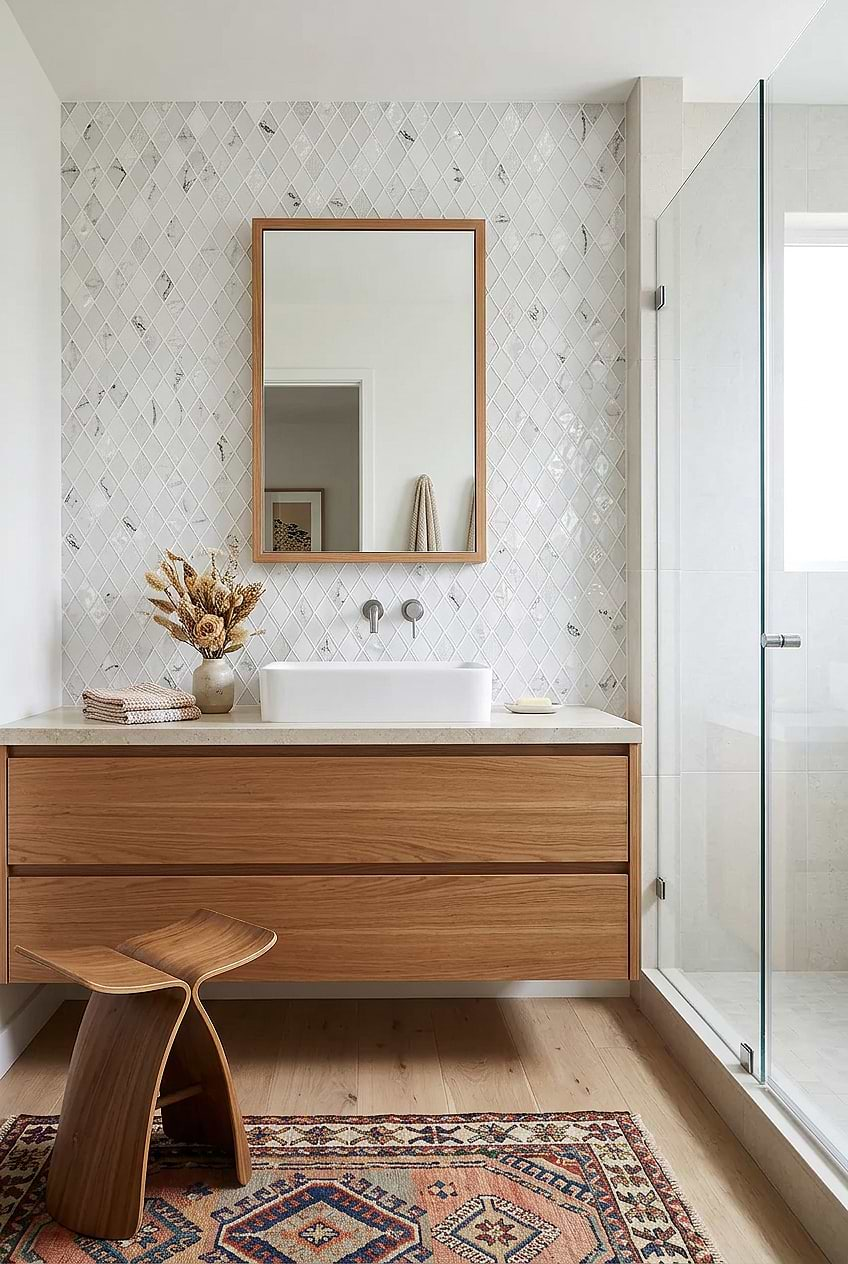
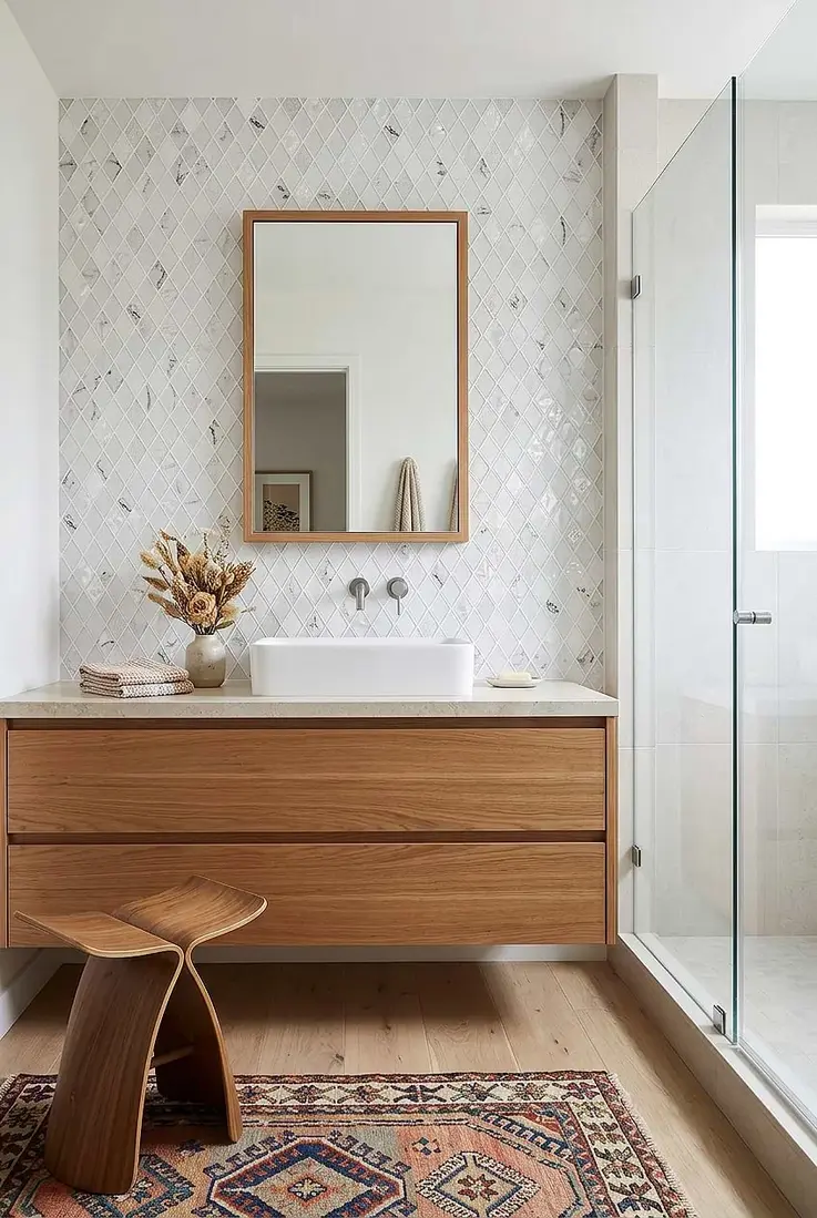
Contrast gives the vanity enough difference to act as a visual anchor. Taupe against pale beige, muted green against cream, or a medium wood against light tile can define the sink area without requiring a dramatic color.
The important distinction is between deliberate contrast and accidental mismatch. A warm taupe can work with beige tile; a random gray with a strong blue cast may make the beige look more yellow by comparison. If two colors seem almost—but not quite—the same, either move farther apart in value or choose a finish that clearly shares the same undertone.
Source: aicdn.speedsize
Painted vanity colors to consider
Painted cabinets are useful when you want to control the color closely or repeat a shade already present in the room.
Warm white and cream
Warm white works with cream, beige, and many blush tiles when you want the vanity to blend without becoming identical to the wall or sanitaryware. Compare it with the countertop before choosing. A white that looks soft beside beige tile may appear noticeably yellow next to a bright white sink.
If the bathroom already contains several off-whites, choose one dominant white family. Mixing a cool, crisp white sink with a strongly creamy vanity can make the difference more visible than expected.
Taupe, greige, and soft beige
These colors create subtle contrast with pale tile while staying restrained. Taupe is often a useful middle ground when white feels too stark and brown feels too heavy. Greige can work with both warm and cool surroundings, but its exact undertone varies considerably, so samples matter.
Muted green or blue
A softened green can connect with cream, beige, or natural wood. A muted blue can provide contrast against warm tile, especially when the room already includes cool metal or gray details. Avoid choosing either color from a screen alone; a small change in saturation can make a color feel much stronger in a compact bathroom.
Navy, charcoal, or black
Dark painted vanities create clear contrast and can suit light tile, pale walls, and simple countertops. They are more visually demanding in a small bathroom because the cabinet occupies a solid block of color. Balance one with lighter surrounding surfaces rather than repeating dark color on every surface.
How wood vanity colors work with tile
Wood introduces both color and visual texture. The question is not simply whether the wood is light or dark, but whether it leans honey, red, gray, or neutral brown.
- Light oak and pale ash: helpful when you want warmth without a large dark mass.
- Medium natural wood: a flexible choice with cream, beige, white, and some muted green tiles.
- Walnut and dark brown: can ground a light bathroom, but may make a small room feel heavier if the floor and walls are also dark.
- Reddish or orange wood: needs more care around pink, peach, or yellow-beige tile because the combined warmth can feel excessive.
- Gray-washed wood: can suit cool tile, but may look disconnected from warm beige or cream surfaces.
Look at the wood sample beside the tile, not just against a white background. A wood finish that appears neutral in isolation may show a strong orange or red cast next to existing tile.
Coordinate the countertop before finalizing the cabinet
The countertop sits between the vanity and the rest of the room, so it can either connect the palette or expose a mismatch. Check its background color, veining, and visible flecks.
A countertop with warm cream or beige movement generally supports warm whites, taupes, natural woods, and other softened finishes. A countertop with blue-gray veining may point toward cool gray, muted blue, charcoal, or a less yellow wood tone.
You do not need to match the vanity to every mark in the countertop. Choose one clear relationship: repeat the countertop’s background color, pick up a subtle vein, or provide a calm contrast that lets the surface remain the bridge.
Let hardware support the color choice
Hardware does not have to match the vanity exactly, but it should not introduce another unrelated temperature. Warm tile often feels orderly with brass, bronze, or champagne-toned hardware. Cool tile commonly sits comfortably with chrome, polished nickel, or stainless-looking finishes. Black can work with either when it is repeated elsewhere in a controlled way.
Treat the faucet, cabinet pulls, mirror frame, light fixture, and shower hardware as a group. If only one item has a noticeably different finish, it may draw more attention than the vanity color itself.
Test samples in the actual bathroom
Before ordering or painting, make a small sample board. Include a piece or photograph of the existing tile, the countertop color, the floor, and one representative hardware finish. Place painted cards or wood samples beside them rather than evaluating each item on its own.
Check the board:
- Near the vanity wall.
- Under the room’s usual artificial lighting.
- In daylight, if the room receives it.
- Beside the sink or countertop, where the color will actually be seen.
- Against towels, bath mats, and other large soft furnishings that will remain.
A sample that looks attractive in a bright store can appear dull, yellow, blue, or much darker in a bathroom. Give yourself time to see it under more than one lighting condition before making the final decision.
Making a small bathroom feel balanced
Small bathrooms do not require an all-white vanity, but a very dark cabinet will carry more visual weight than a pale one. If you prefer a dark vanity, keep some larger surrounding surfaces light and avoid adding several competing dark accents.
A light or medium vanity can help the room feel more open, especially when the tile is already busy. Open floor area, a simple mirror, and fewer contrasting finishes can matter as much as the cabinet color.
For a rental or a refresh rather than a full replacement, coordinate removable details first: pulls, mirror frame, towels, bath mat, and countertop accessories. These can help a less-than-perfect vanity color feel connected to the existing tile without forcing every surface into the same shade.
A practical final test
Choose the vanity color that satisfies these three checks:
- It shares an undertone with at least one important fixed surface, or contrasts with it clearly.
- It works beside the countertop and sanitaryware, not just beside the tile.
- It still looks acceptable in the bathroom’s real light and at the room’s actual scale.
When in doubt, favor a calm, slightly distinct color over an almost-match. The goal is not to make the vanity vanish; it is to make its relationship with the existing tile look considered.
References
- Top Bathroom Vanity Colors & Trends. (n.d.). https://www.bertch.com/blog/popular-bathroom-vanity-color-ideas-exploring-the-vibrant-world-of-vanities
- Bathroom vanity color to match warm tone?. (n.d.). https://www.facebook.com/groups/homedesign/posts/2286826742040166
- Best Bathroom Vanity Colors: 7 Popular Choices for Your …. (n.d.). https://water-creation.com/blogs/all-blogs/best-bathroom-vanity-colors-7-popular-choices-for-your-home
- Which Colors Work Best With Beige Bathroom Tile Designs?. (n.d.). https://solidshape.com/blogs/blog/colors-with-beige-bathroom-tiles
- How Do You Choose The Perfect Color Palette For Your Bathroom Renovation?. (n.d.). https://www.edwardmartin.com/blogs/information/how-do-you-choose-the-perfect-color-palette-for-your-bathroom-renovation
- Help me pick a paint color for my bathroom. (n.d.). https://www.reddit.com/r/HomeDecorating/comments/1vpyppl/help_me_pick_a_paint_color_for_my_bathroom
- Bathroom tile undertones look off. (n.d.). https://www.houzz.com/discussions/3892623/bathroom-tile-undertones-look-off
- Bathroom Color Schemes: 12 Palettes That Work. (n.d.). https://facadecolorizer.com/us/blog/bathroom-color-schemes-2026