Should Bathroom Wainscoting Be White or the Same Color as the Walls?
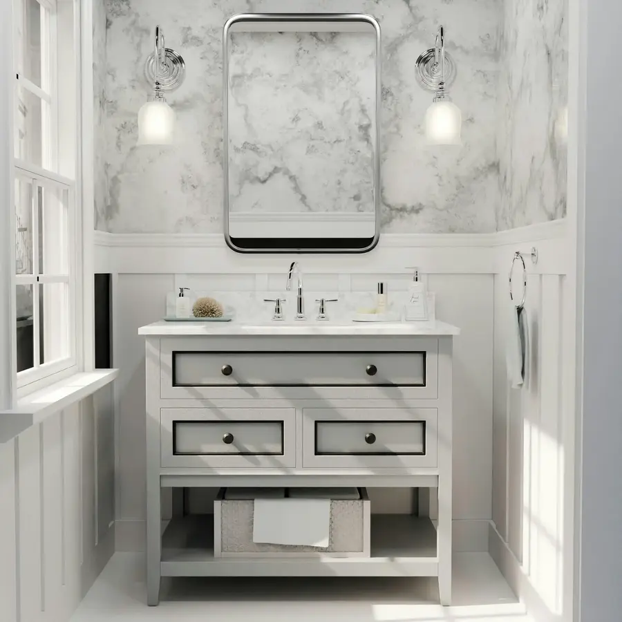
The best bathroom wainscoting color depends on what you want the lower half of the room to do. White wainscoting creates a clear, crisp break and helps a darker or patterned upper wall feel organized. Wainscoting painted the same color as the walls creates a quieter, more continuous look and lets the panel texture provide the interest.
For most small bathrooms, white or a light version of the wall color is the easier choice. A matching or darker color can work especially well when the room has good natural light, a simple upper wall, or a vanity and hardware that can support the stronger color.
Start with the role of the wainscoting
Before choosing a paint color, decide whether the wainscoting should look like trim or like part of the wall.
- White or off-white wainscoting reads as architectural trim. It separates the lower wall from the upper wall and gives the room a traditional, tidy structure.
- Wainscoting in the wall color reads as one continuous surface. The panel grooves, battens, or beadboard provide texture without introducing another major color.
- A darker or more saturated color makes the lower section a focal point. This can add depth, but it also gives the wainscoting more visual weight.
There is no rule that bathroom wainscoting must be white. White is simply the most forgiving option because it coordinates with common white fixtures, ceilings, and trim.
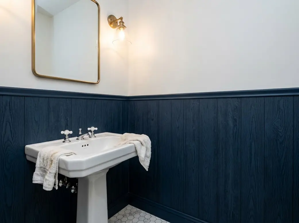
Source: woodywalls
When white wainscoting is the better choice
White wainscoting works well when you want separation, brightness, or a classic bathroom appearance. It is especially useful in the following situations.
The upper wall has wallpaper
Wallpaper already brings color, pattern, or both. White wainscoting gives the eye a calm stopping point and prevents the lower wall from competing with the pattern. This is particularly helpful when the wallpaper contains several colors or a small repeating design.
The white does not have to be stark. A warm off-white can work better with beige, cream, tan, muted green, or warm wood. A cooler white may suit blue, gray, or black-and-white wallpaper. Compare the paint sample with the wallpaper in the actual bathroom rather than choosing by name alone.
The bathroom is small or has limited natural light
A light lower section can help the room feel more open, although it will not change the actual dimensions. White panels also coordinate easily with a white toilet, tub, sink, or light countertop, making the room feel less visually divided by separate fixtures.
If the bathroom is already busy with a patterned shower curtain, colorful towels, or several finishes, white wainscoting can provide useful restraint.
The vanity is dark or strongly colored
White wainscoting can balance a navy, charcoal, dark green, or wood vanity. It repeats the light color of the sink or countertop while keeping the vanity from becoming the only heavy element in the room.
This does not mean every dark vanity requires white panels. It means white is a dependable counterweight when the rest of the room has limited light colors.
You want a traditional contrast
White beadboard below a colored wall is a familiar combination because the vertical texture is easy to see. White board and batten also creates a clean frame around a painted upper wall. The effect is strongest when the top rail, baseboard, door trim, or ceiling trim uses the same white family.
When matching wainscoting to the walls works better
Painting the wainscoting and upper walls the same color creates a more unified room. This approach is useful when the paneling is meant to add texture rather than contrast.
The bathroom has a simple wall treatment above
If the upper wall is a single paint color, matching the lower section can keep the room from feeling split into two horizontal bands. This is a good option for a small bathroom where a strong contrast would make the wall divisions more noticeable.
You can still create distinction by using different paint sheens, though the change should be subtle. The panel profile, shadow lines, and trim will usually provide enough variation without needing a second color.
The wainscoting has a strong profile
Deep board-and-batten layouts, raised panels, or wide rails already attract attention through their shape. Painting them the same color as the wall lets the construction detail show without adding another competing block of color.
This is also a practical approach when the bathroom has several fixed elements that cannot be changed. A continuous color can help the vanity, toilet, towel hooks, and other accessories sit within one calmer background.
You want a moodier or more cohesive room
Blue, green, gray, and earthy neutral wainscoting can make the bathroom feel more intentional. A saturated lower section is often easier to live with when the upper wall is lighter, the room receives good daylight, or the ceiling and fixtures provide enough visual relief.
A blue bathroom wainscoting color can range from soft gray-blue to deep navy. Pale blue keeps the room light and relaxed; navy creates stronger contrast and needs more support from lighting and lighter surfaces.
[[IMAGE:blue-wainscoting-wallpaper]]
Use the fixed elements as your color guide
Because wainscoting is usually installed around a vanity, toilet, tub, or towel hardware, choose the color in relation to those elements rather than in isolation.
Vanity color
- White vanity: Nearly any wainscoting color can work. White panels create a coordinated look, while a color adds distinction.
- Wood vanity: Warm white, cream, muted green, and blue can complement the wood. Avoid choosing a bright white if the wood and other finishes are noticeably warm unless you want a deliberate contrast.
- Dark vanity: White or light wainscoting can balance it. A matching dark color creates a more dramatic, enclosed effect.
- Painted vanity: Repeat the vanity color only if you want a strong coordinated look. Otherwise, use the wainscoting to connect the vanity with the trim, countertop, or upper wall.
Trim and ceiling
Matching the wainscoting to the existing trim is the safest way to create a finished appearance. If the baseboard, door casing, window trim, and ceiling are all white, white wainscoting will look naturally connected to them.
If the trim is painted, the wainscoting can match it, use a related lighter shade, or follow the wall color. Avoid introducing a fourth unrelated neutral unless the room is large enough to support several distinct tones.
Hardware finish
Hardware does not need to match the wainscoting color, but it should make sense with the overall palette. Brass often works comfortably with warm whites, cream, sage, muted blue, and wood. Chrome and polished nickel can support cooler whites, gray, and blue. Black hardware can reinforce a dark wainscoting color or provide definition against a light one.
Treat this as coordination rather than a strict matching exercise. A bathroom does not need every finish to be identical.
How wallpaper changes the decision
When wallpaper is above the wainscoting, pull one quiet color from the pattern rather than automatically choosing white. The wainscoting can match the wallpaper background, repeat a secondary color, or use a softened neutral that does not appear prominently in the pattern.
Use white when the wallpaper is already visually dense or when the room has white fixtures and trim to repeat. Use a colored wainscoting when the wallpaper has a simple pattern and the lower color helps connect it to the vanity, floor, or towels.
A strong color below and a strong pattern above can work, but both elements should share at least one visual relationship. Without that connection, the wall may look divided rather than layered.
A simple decision process
Use this sequence before buying paint:
- Look at the upper wall. If it is patterned or dark, start with white, off-white, or a quiet related neutral.
- Check the room’s light. Limited daylight favors lighter colors; good daylight gives you more freedom to use saturated shades.
- Identify the dominant fixed color. Consider the vanity, countertop, flooring, tub, and existing trim.
- Decide whether you want contrast or continuity. Choose white for a clear break and a matching color for a blended effect.
- Test large samples in the bathroom. Check them near the vanity, trim, wallpaper, and artificial light at different times of day.
Practical finish considerations
Bathroom walls can experience splashes and condensation, so choose a paint labeled for the intended interior use and follow the product directions. A washable finish is generally more convenient on the lower section because it is closer to sinks, towels, and everyday contact. The exact sheen matters less than choosing a suitable product and preparing the surface properly.
The color decision should come first, but do not ignore the material and condition of the wainscoting. Seams, edges, and existing damage may remain visible regardless of whether the panels are white or colored.
Bottom line
Choose white bathroom wainscoting when you want crisp separation, an easier match for fixtures and trim, or a calm base beneath wallpaper. Choose a darker, softer, or matching wall color when you want the paneling to blend in, emphasize texture, or create a more cohesive mood.
If you are undecided, compare an off-white sample with a sample of the wall color beside the vanity and trim. The better choice is usually the one that supports the room’s fixed elements without making the wainscoting feel like an isolated strip.
References
- Top 10 Wainscoting Bathroom Ideas. (n.d.). https://www.youtube.com/watch?v=pvBJOr0k7h0
- Bathroom Wall Wainscoting and Color | Houzz Forum. (n.d.). https://www.houzz.com/discussions/5208953/bathroom-wall-wainscoting-and-color
- Bathroom Wainscoting Ideas That Work: Stylish & Budget-Friendly. (n.d.). https://fancyhouse-design.com/blog/bathroom-wainscoting-ideas-that-work-beautiful-and-budget-friendly-ideas-for-small-bathrooms
- Bathroom Wainscoting Ideas: From Traditional to Modern | Decoist. (n.d.). https://www.decoist.com/bathroom-wainscoting-ideas
- 23 Wainscoting Ideas That Add Character to Every Room | Benjamin Moore. (n.d.). https://www.benjaminmoore.com/en-us/project-ideas-inspiration/interiors/wainscoting-ideas
- What kind of paint finish in this situation - half wall …. (n.d.). https://www.reddit.com/r/paint/comments/ft10t1/what_kind_of_paint_finish_in_this_situation_half
- Top 10 Two Tone Wainscoting Ideas. (n.d.). https://www.youtube.com/watch?v=0Eba9FhYfr8
- 20+ Bathroom Wainscoting Ideas for Stylish Walls. (n.d.). https://www.backsplash.com/bathroom-wainscoting